Ask a developer to picture "programming" and the image is remarkably consistent: light text on a dark screen, every character the same width, probably a blinking cursor. This is strange if you think about it. We have had high-resolution color displays for decades, and yet the profession's visual identity is still a 1970s terminal. That persistence is worth explaining, because the terminal aesthetic is one of the few design languages that earned its look entirely through function and then kept it as culture.
Where the green glow came from
Early video terminals drew text with an electron beam exciting a phosphor coating inside a cathode-ray tube, and the color you saw was chemistry, unrelated to fashion. Green phosphors were common because they were effective and easy on the eyes for long sessions, and terminals like DEC's VT100, introduced in 1978, burned that green-on-black image into a generation of programmers. Amber displays followed as an alternative that many operators found comfortable, which is why retro themes today come in exactly two flavors: green like a mainframe terminal, amber like a workstation that thought it was fancy.
The dark background was also functional. On a CRT, lit phosphor is the expensive part, and drawing a few glowing characters on a black field was the natural mode. Decades later, when dark mode swept every app on earth, developers got to feel smug. The terminal had been dark the whole time.
Phosphor also gave the aesthetic its texture. Characters on those tubes glowed with a soft bloom and faded with a slight persistence when the screen updated, which is why modern retro-terminal themes ship with scanlines, glow, and flicker options. People are not simulating a limitation. They are simulating a warmth that flat pixels never quite reproduced.
The logic of monospace
Fixed-width type predates screens. Typewriters moved the carriage a uniform distance per keystroke, so every character had to occupy the same width, and early computer output inherited the constraint through teletypes and line printers. What began as a mechanical limitation turned out to be exactly what code wanted.
Code is text with spatial structure. Indentation carries meaning, columns align, and a misplaced character is a bug, so a typeface where every character occupies identical space makes structure visible and anomalies findable. Proportional fonts optimize for reading prose. Monospace optimizes for noticing that something is one character off, which is a fair summary of the job.
This is why developers hold strong opinions about fonts with names like JetBrains Mono, Fira Code, and IBM Plex Mono, and why a zero without a slash through it can start an argument. The font is a tool, and craftspeople argue about tools.
From necessity to identity
Aesthetics born of constraint have a way of outliving the constraint. Nobody needs a green-on-black terminal anymore, and yet developers configure their brand-new machines to look like hardware from before they were born. Part of it is ergonomics, since dark backgrounds and high-contrast text remain genuinely comfortable for long sessions. Part of it is signaling, the way a chef's knife roll or a carpenter's worn toolbelt communicates hours logged.
Pop culture did its share too. The Matrix in 1999 put cascading green glyphs in front of everyone on the planet, and a thousand hacker-movie screens reinforced the association: dark screen plus monospace equals someone who knows what they are doing. The stereotype is silly and developers know it is silly, which is precisely why we enjoy dressing the part.
The aesthetic even escaped the profession. Monospace type now shows up in fashion lookbooks, album art, and the branding of companies that have never shipped software, borrowed for the same reason brands borrow workwear: it signals competence without saying a word. Developers watch this with mixed feelings and quiet satisfaction. Our work uniform became a style, and we did not even have to change clothes.
The terminal renaissance
Here is the twist that makes the aesthetic current rather than nostalgic. The terminal was supposed to fade into a legacy interface, and instead the most advanced developer tools of this decade moved in. Claude Code, Anthropic's coding agent, runs in the terminal. A wave of modern terminal emulators, TUI applications, and CLI-first tools has made the command line the site of the newest workflows rather than the oldest.
So the monospace prompt now signifies two things at once: the deepest traditions of computing and its bleeding edge. There are not many visual languages that can claim both. The blinking cursor waited fifty years and turned out to be the interface of the AI era, which is the kind of plot twist the terminal would render in green.
How this shapes what we print
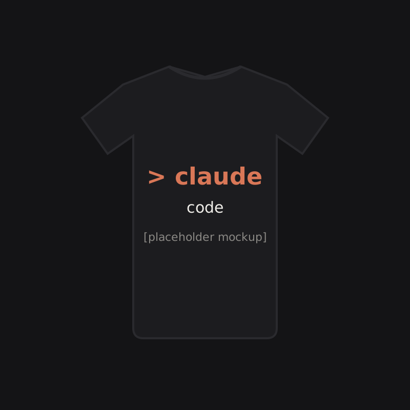
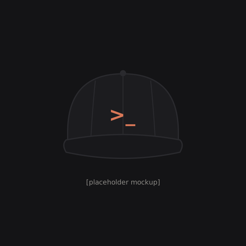
When we design merch, the terminal aesthetic is the whole brief. Monospace type, prompt glyphs, restrained composition, nothing a text mode display could not render. The Claude Code Terminal Tee is set the way a terminal would set it. The Prompt Glyph Dad Hat reduces the idea to a single embroidered mark, which is about as close as a hat gets to a command prompt.
The reason is durability, visual and cultural. Trend-driven graphics expire. The terminal look has been current since the VT100 and is somehow more current now, so a shirt built on it will read correctly in ten years. We print the aesthetic because we trust it, and we trust it because it has out-survived every attempt to replace it.